Blog Archives
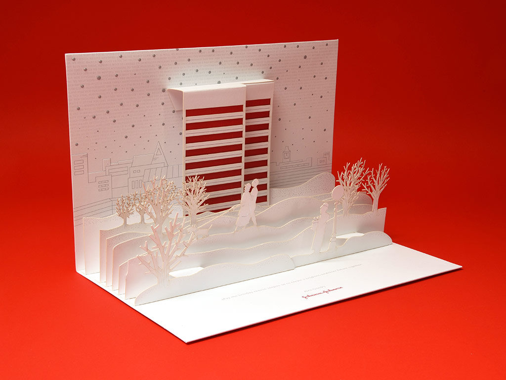
01.15.17 — Johnson & Johnson
We had the privilege of working with J&J Design to concept and develop pop-up Holiday Cards for Johnson & Johnson’s CEO Alex Gorsky. Initially we explored 4 distinct directions. When the 3D pop-up idea was selected, we developed 3 different pop-up winter scene concepts as well as card mechanicals. Once the final concept was approved, we worked on developing final color palette as well as print techniques such as foil, embossing and laser cutting.
Working closely with J&J Design and Structural Graphics we were able to enjoy the design process, produce a unique card design and deliver it just in time for the holidays. This was truly a fun project as print design with such attention to detail is something we truly treasure.
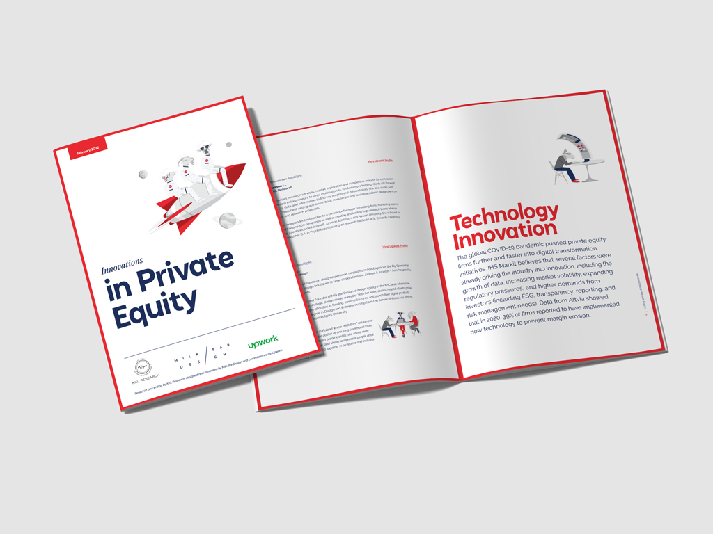
08.26.23 — Upwork
UpWork chose us to design an exclusive report on “Innovations in Private Equity,” based on their own research findings. We took a hands-on approach, crafting the report with simple layouts, engaging infographics, and a series of custom illustrations tailored for this project. These design elements didn’t just fit seamlessly with the content; they also added a humorous twist. We executed the entire project under the Milk Bar Design brand, showcasing our unique visual language. In addition to the report, have have also been tasked by UpWork to design a set of conversation cups for a networking event – this time using UpWork’s color theme – we made our cow be the hero.
Joanna, the founder of Milk Bar Design, took inspiration from the community spirit of Poland’s “Milk Bars” to shape her studio’s unique ethos. This ethos comes to life through three symbolic milk-producing animals—Goat, Cow, and Sheep. Each animal represents a core principle that guides our work: the Goat symbolizes visionary thinking, the Cow embodies strong work ethic, and the Sheep stands for our commitment to transformative design. These principles influence all our design engagements, including this report for UpWork.
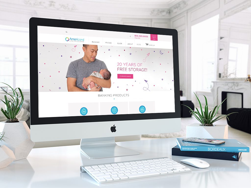
01.26.16 — Americord
Americord is a leader in the advancement of umbilical cord blood, cord tissue, and placenta tissue banking. They are a private bank, which collects, processes, and stores stem cells for future medical or therapeutic use by the family who saves them. Americord reached out to us when they were looking for a digital partner to help refresh their brand, redesign their website and broaden various marketing materials.
With the website task, we had set out to first reorganize and simply the complex and often overwhelming information of stem cell banking. We created a brand new site map and reduced the number of unnecessary pages, followed by a complete set of wireframes which we later translated into simplified responsive visual layouts. Together with Americord’s team we took the already existing complex copy content and completely redefined it. We created illustrations, infographics and a set of product icons which allowed us to make informative points more clearly and allow layouts to have elements of visual fun. In addition we restructured and simplified the check out process, making it fast and easy for customers to enroll. Lastly we helped organize and art direct a photoshoot of children, moms-to-be and parents.
We have had the privilege of continuously working with Americord since April of 2014 and in addition to the website work, we have been delivering ads, landing pages, emails and print marketing materials on regular basis.
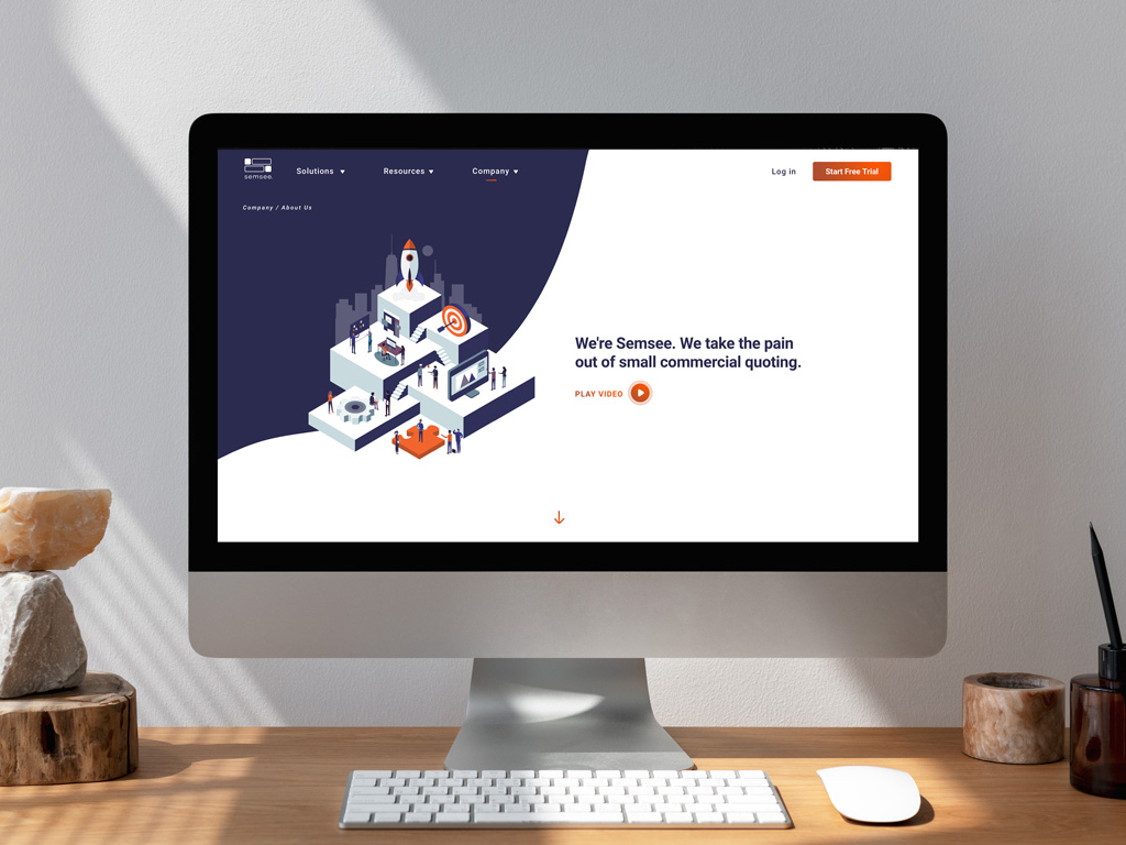
07.22.22 — Semsee
We have worked with Semsee on an ongoing basis for almost 4 years – where does the time go? Initially, we had been tasked with an audit of their app and brand elements. After taking a closer look we decided to engage in a bigger app redesign and larger expansion of their brad elements by leveraging illustration. We set to work by first redesigning their digital product – a platform where insurance agents come to quote small commercial business insurance for their clients. Together with team Semsee, we designed an easy-to-use web app, where agents fill out a single form and get multiple quotes from various carriers – allowing them to quickly compare results and manage their clients and business all in one place.
We have also designed Semsee’s website as well as many marketing materials such as digital brochures, white papers, surveys, social templates, holiday cards, and more. Semsee has been a great partner to work with and we are delighted they now have their own in-house design team.
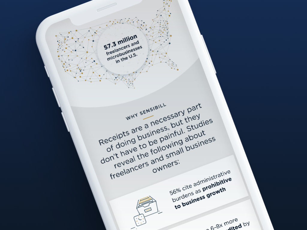
12.13.18 — Sensibill
We had the privilege of designing the new Sensibill website. Sensibill is a receipt management solution for mobile banking apps. The work included site-mapping, wireframes, ux and visual design in order to deliver fully responsive experience. Working together with Sensibill’s marketing team we were able to strategize and define a clear product offering, through the usage of simple messaging and visual touch points such as illustrations, icons, product mockups and patterns.
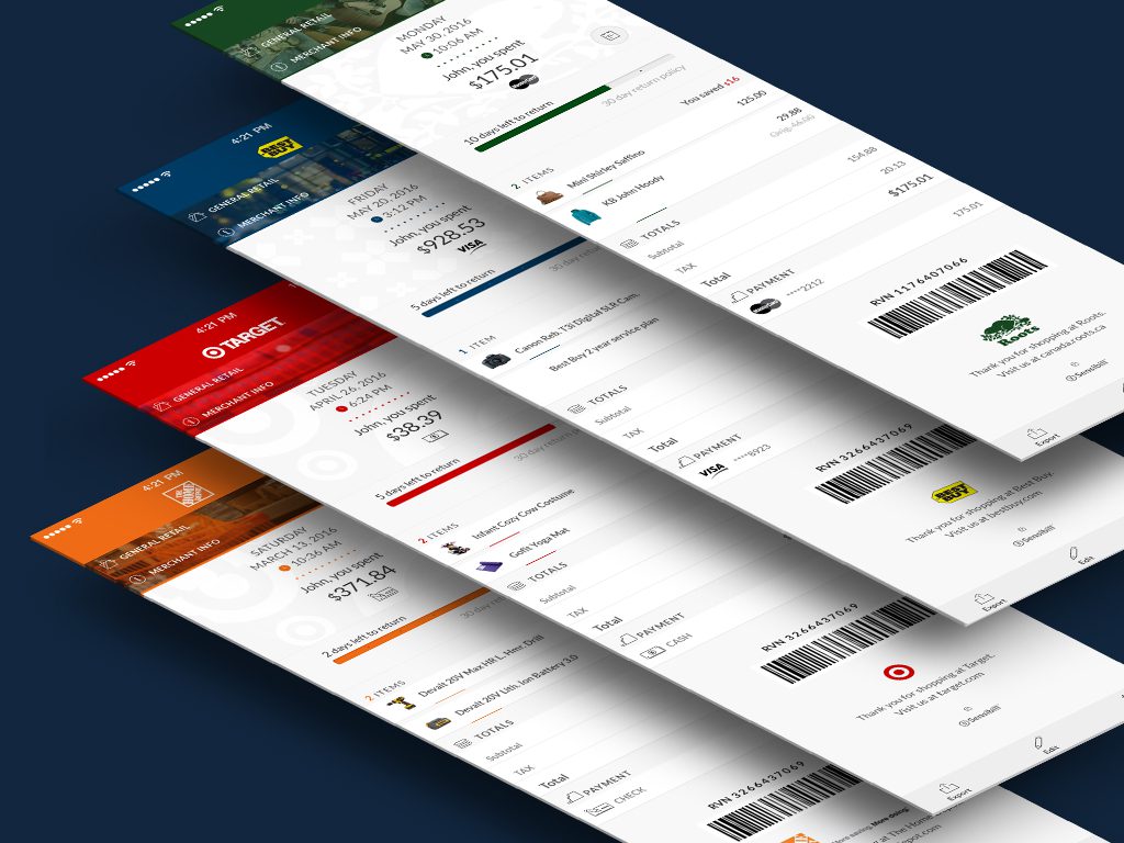
03.15.15 — Sensibill iOS App
When this exciting tech start up had an idea of transforming how the consumer thinks and interacts with purchase receipts they reached out to us to help visualize their digital solution. We have partnered with their talented tech and ux team to develop a universal, intuitive system for managing and storing purchase receipts in one iOS app.
We have helped design all of the screens of the app including signing up, on-boarding, dashboard, receipt listing, folder listing, filters and search tools as well as settings. Together we have replaced the old school shoe box solution with a dynamic platform where user can take a photo of their receipt and allow the app to do the work for them. This new system makes it easy to scan, store, organize, and manage all of your receipts down to warranty tracking and easy purchase returns. Gone are the days of paper receipts!
In addition to the app, we have given Sensibill a visual rebrand by updating their brand identity, color palette and typography. We have designed their stationary, landing page, keynote pitch presentations and trade show graphics.
We have had the privilege of working with Sensibill since October of 2013 on weekly basis.
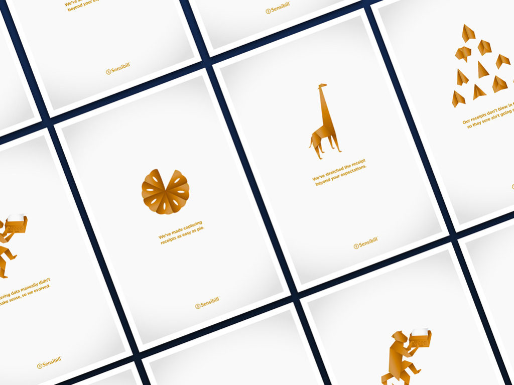
12.14.18 — Sensibill
We have been working with Sensibill for over 5 years, these are some examples of promotional touch-points we helped develop for the marketing team. They include infographics, post cards, flyers, posters and give away items such as a deck of cards.
04.27.20 — Kooltra
Kooltra is the only cloud-based, post-trade management system designed for FX brokers, integrated with currency trade execution platforms for a seamless and fast use. Their powerful analytics, customizable dashboard and risk management tools allow FX brokers to stay on top of their business of currency trading in real time. Kooltra serves agency, margin, institutional and deliverable brokers, corporate MSBs in North American and Europe.
We set out to design a logo mark which would directly represent the function of Kooltra. This being a two fold notion – the idea of a bridge automatically bringing together information normally reserved to manual Excel spreadsheets and the idea of clarity – taking complex and vast amount of information and distilling it into one simple system. Our work included logo design and brand development, website design and marketing materials such as PowerPoint presentations, one pagers and a set of posters. We developed a reduced color palette, unique illustrations, iconography, patterns – then applied this visual language consistently though-out all of the touch points. Together with Kooltra’s marketing team we were able to research, strategize, and define their brand values and develop a consistant brand voice. They have been a great partner to work with and it is our hope this new design system serves them well into the future.
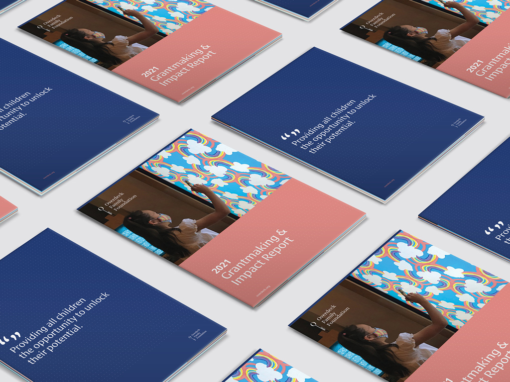
02.03.22 — Overdeck Family Foundation
Annual report design for Overdeck Family Foundation, a non-profit organization, with the single goal of providing all children the opportunity to unlock their potential. They focus exclusively on enhancing education, funding efforts both inside and outside of school in the areas of early childhood, informal STEM education, and K-9 programs that include supporting educators and student-centered learning environments. They came to us with the goal of creating an impactful annual report, showing the measurable impact the organization and their portfolios have made in the area of children’s education in 2021. Using their brand guidelines, we were able to build and expand their visual language and create dynamic layouts for the annual report – impact report 2021. It was a pleasure to have worked with Lina and Brittany, we wish them continued success in such an important area for our future generations.
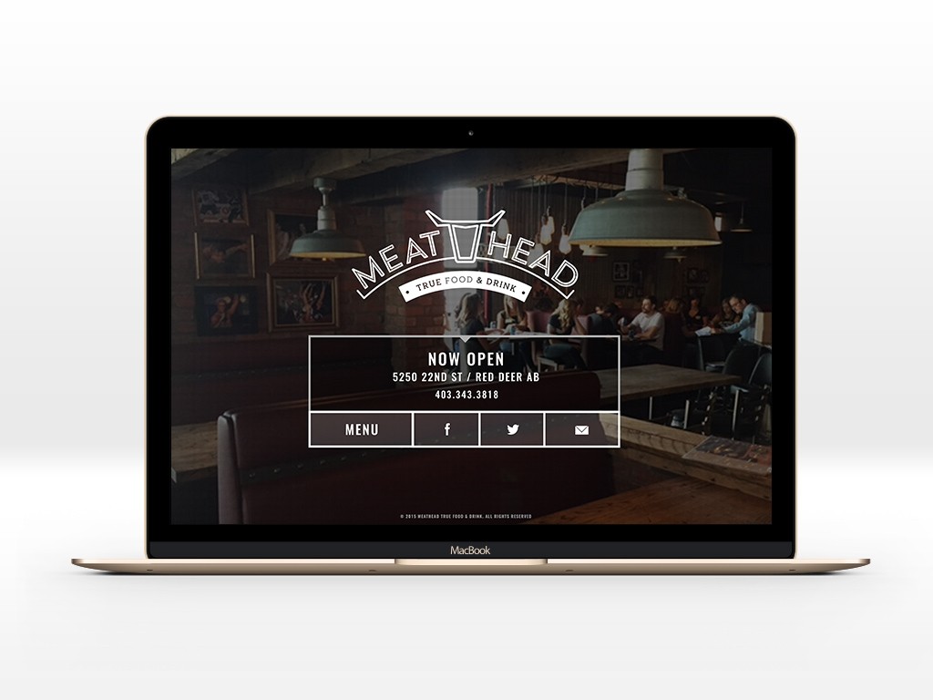
01.27.16 — Meathead True Food & Drink
Meathead is a new, polished, rustic dive-bar where everyone is welcome, offering a high-quality meat-focused menu at low prices. For this project we were asked to redesign their existing logo and create a series of menus, main front door signage, t-shirts, hats, business cards, a series of coasters and a landing page.