Posts tagged ‘Animation’
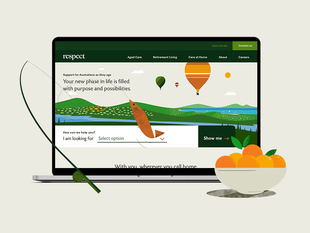
08.02.23 — Respect
Respect supports Australians as they embrace the journey of getting older, offering a compassionate hand at every step. Whether it’s in-home care, a retirement home, or a nurturing nursing facility, Respect provides the care and attention they deserve.
We meticulously helped craft a brand positioning and visual identity system. Inspired by nature’s changing seasons, we designed a bold, captivating logo and selected a vibrant color palette that like nature embodies life’s natural rhythms.
To add a touch of joy to the brand narrative, we created a unique set of bold, whimsical illustrations, brought to life through delightful animations. In the digital landscape, we designed the main Respect website and three distinct retirement living websites, all tailored to reflect their commitment to excellence while our creative touch was also reflected on billboards and select marketing materials. Our words and content strategy delved into the heart of Respect’s ethos, crafting copy that resonates with genuine care. All touchpoints harmoniously unify Respect’s various offerings under one powerful and cohesive brand system.
At Milk Bar Design, we’re more than designers; we’re storytellers, passionate about elevating the lives of those we serve. Our journey with Respect is a celebration of aging, a testament to cherishing every moment, and a commitment to crafting a future filled with compassion and creativity.
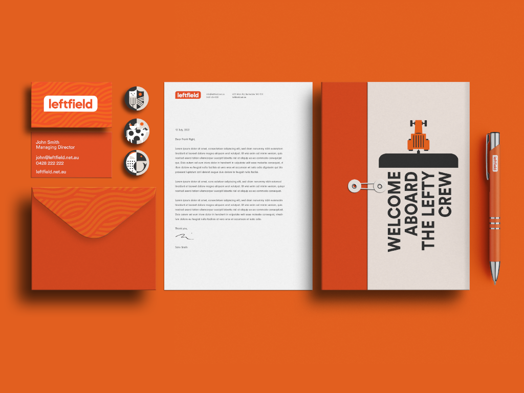
07.07.22 — Left Field
Left Field is an on-demand staffing service specializing in the placement of agricultural workers with farmers in Tasmania, Australia. Their target audience – are the locals and international backpackers looking for an adventure with some seasonal work to help pay for it. They came to us after acquiring the business, with expanded service ideas, a brand new name, and the need for a complete brand overhaul.
In partnership with the client, we have designed the brand positioning and a visual identity system consisting of a logo, and a reduced color palette inspired by the early sunrises and late sunsets on a Tasmanian farm. A custom set of patterns influenced by the patterns found in the crops grown on various farms, and a set of bold geometric illustrations. The final deliverables consisted of a brand guidelines document to govern the newly designed brand identity system, a website, and various marketing materials. The website work not only consisted of visual design but also content strategy and copy. While we kept the website simple and easy to use, we found a few opportunities for delight through animations – for example, right after a job seeker submits a job application they are greeted by a farmer and his dog driving out into the fields to get started with the day.
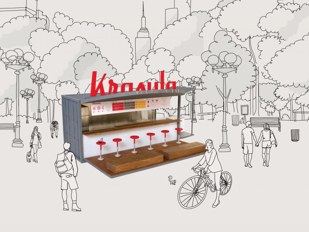
05.31.15 — Krasula Pierogi Bar
Krasula is a pop-up pierogi bar that brings modern Polish flavor to the bustling New York food scene. Eastern European soul food – the pierogi is a half-moon shaped dumpling, traditionally made by hand, filled with sweet or savory ingredients. At Krasula menu offerings are simple, made with fresh, natural ingredients, and an array of rejuvenated pierogi fillings, toppings, and whole grains. However you will always find, the traditional pierogi such as potato & cheese and cabbage on the menu. We cater to the traditional eater, as well as the vegetarian, the vegan and the gluten free conscious persons.
This is is a self-initiated project, conceived out of Joanna’s love for Pierogi and the need of elevating Polish culinary culture in New York. We have fully branded the bar, re-designed the recipes and sauces, stylized food plates and designed the physical experience of the space. We are currently looking for like minded, pierogi loving investors, if you are one please don’t hesitate to reach out. To learn more please visit the website: krasulapierogibar.com
Krasula is the winner of Martha Stewart American Made Elevator Pitch competition.