Posts tagged ‘Brand guidelines’
07.07.22 — Left Field
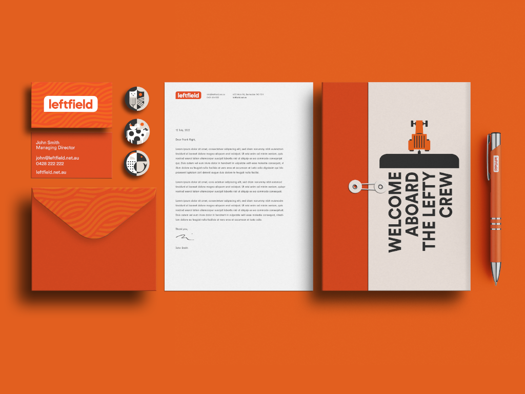
Left Field is an on-demand staffing service specializing in the placement of agricultural workers with farmers in Tasmania, Australia. Their target audience – are the locals and international backpackers looking for an adventure with some seasonal work to help pay for it. They came to us after acquiring the business, with expanded service ideas, a brand new name, and the need for a complete brand overhaul.
In partnership with the client, we have designed the brand positioning and a visual identity system consisting of a logo, and a reduced color palette inspired by the early sunrises and late sunsets on a Tasmanian farm. A custom set of patterns influenced by the patterns found in the crops grown on various farms, and a set of bold geometric illustrations. The final deliverables consisted of a brand guidelines document to govern the newly designed brand identity system, a website, and various marketing materials. The website work not only consisted of visual design but also content strategy and copy. While we kept the website simple and easy to use, we found a few opportunities for delight through animations – for example, right after a job seeker submits a job application they are greeted by a farmer and his dog driving out into the fields to get started with the day.
01.25.16 — Stretch Roman Pizza Co.
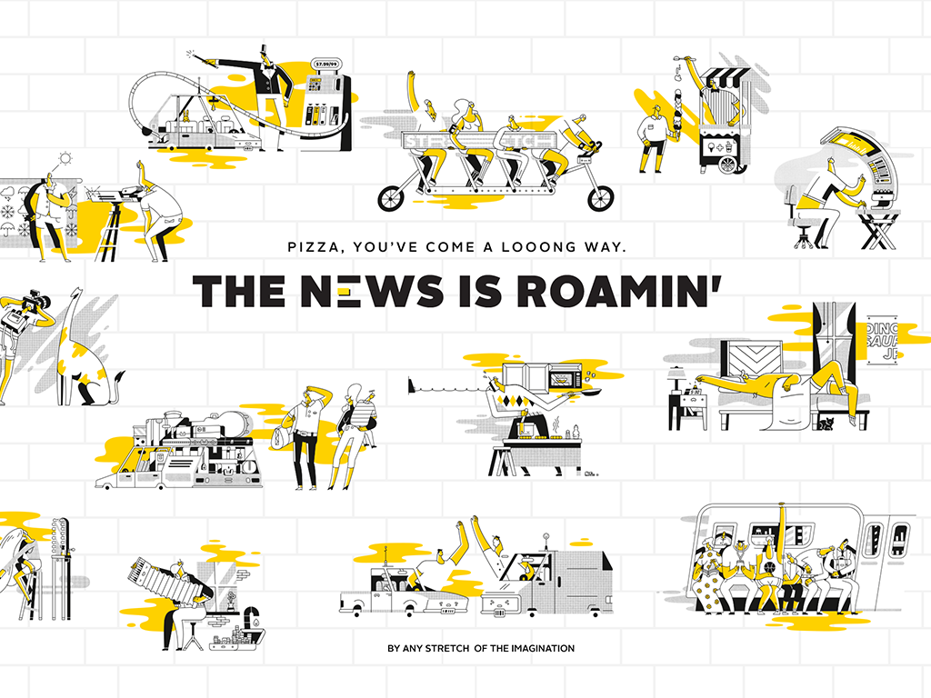
We were approached by a group of successful restaurateurs to design the brand for their new idea – a Roman style pizza restaurant, inspired by the popular gourmet street food of Rome, a fluffy delicious, rectangular pie called “pizza al taglio”.
We set out to design a brand whose primary goal was to offer an honest, moment of delight with delicious pizza supported by imaginative brand voice. Stretch pizza inspires culinary creativity, so we placed an element of play at the core of all brand’s communications. It is expressed in the food served, logo design, illustrations, photography, language, merchandize and in the interior design of the space as well as the website. We have created a fun and flexible system on which we can only continue to build on.
We especially enjoyed collaborating and art directing a set of quirky illustrations that celebrate the personality of Stretch and serve as tone of this brand. They appear on packaging, website, and throughout the restaurant. We asked ourselves, if Stretch is imaginative, why not imagine the world of Stretch? Stretch illustrations express this world through humor of the unexpected yet relatable situations of daily life as they relate to physical or metaphorical acts of stretching. After all who doesn’t love a good Stretch.
08.25.23 — Monis
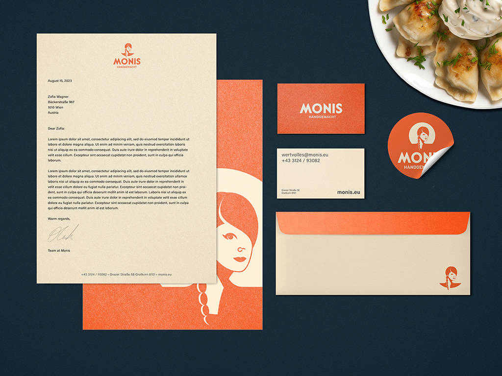
Our team at Milk Bar Design collaborated with Monis, a premium Austrian brand specializing in frozen dumplings and ravioli. The collaboration aimed to support Monis’ goal of expanding beyond its national borders. Our design services included brand strategy, packaging design, brand identity, and comprehensive brand guidelines. To further elevate Monis’ top-quality products, we created a versatile packaging template system along with custom iconography to distinguish various filling types. We incorporated elements of the Austrian mountains into the custom wordmark to honor the brand’s roots, and recognizing that the founder is at the heart of this brand, we created a custom portrait of her as the centerpiece. This bold visual system not only underscores Monis’ commitment to quality and seasonal ingredients but also positions them for international market leadership in the gourmet frozen food sector.