Posts tagged ‘Illustration’
02.07.24 — Fisamed
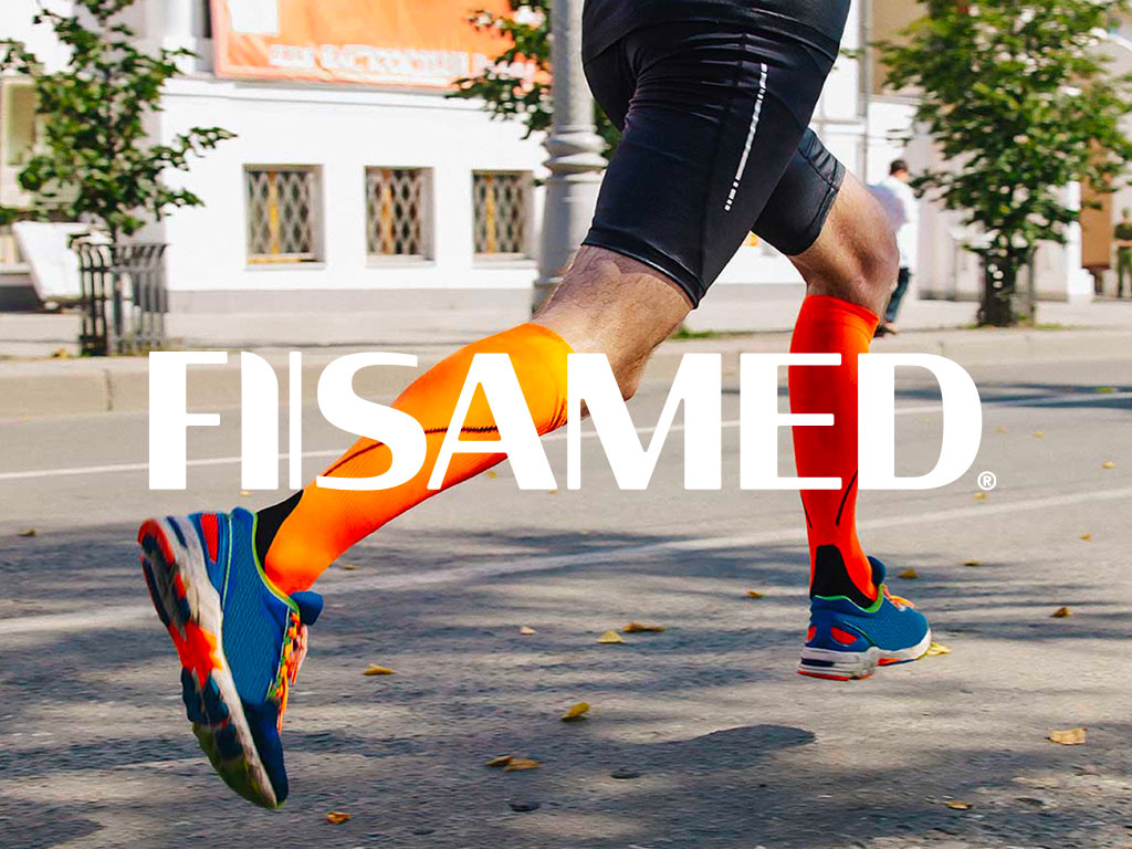
Fisamed is on a mission to enhance wellness and vitality within the Mexican community. With a primary goal of preventing varicose veins, they’re dedicated to providing innovative leg compression solutions that effortlessly integrate into daily life. Our assignment? To craft a unique brand identity and design packaging that encapsulates Fisamed’s unwavering commitment to delivering the most comfortable and superior made-in-The-USA products in the market. The product line spans four categories: base, premium, performance, and maternity, each uniquely color-coded with a bright yet limited color scheme. This intentional design not only adds a vibrant touch but also ensures easy and quick category distinction. We truly enjoyed working with Jesus and Raquel at Fisamed to help bring their dream to reality.
08.02.23 — Respect
Respect supports Australians as they embrace the journey of getting older, offering a compassionate hand at every step. Whether it’s in-home care, a retirement home, or a nurturing nursing facility, Respect provides the care and attention they deserve.
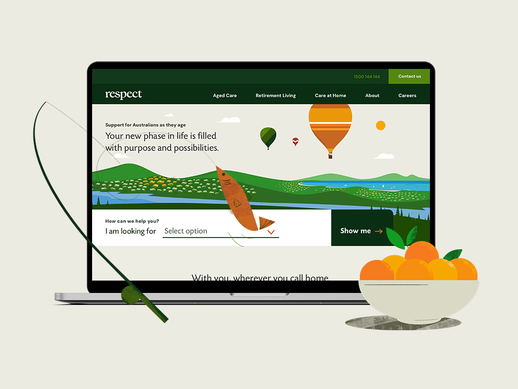
We meticulously helped craft a brand positioning and visual identity system. Inspired by nature’s changing seasons, we designed a bold, captivating logo and selected a vibrant color palette that like nature embodies life’s natural rhythms.
To add a touch of joy to the brand narrative, we created a unique set of bold, whimsical illustrations, brought to life through delightful animations. In the digital landscape, we designed the main Respect website and three distinct retirement living websites, all tailored to reflect their commitment to excellence while our creative touch was also reflected on billboards and select marketing materials. Our words and content strategy delved into the heart of Respect’s ethos, crafting copy that resonates with genuine care. All touchpoints harmoniously unify Respect’s various offerings under one powerful and cohesive brand system.
At Milk Bar Design, we’re more than designers; we’re storytellers, passionate about elevating the lives of those we serve. Our journey with Respect is a celebration of aging, a testament to cherishing every moment, and a commitment to crafting a future filled with compassion and creativity.
07.07.22 — Left Field
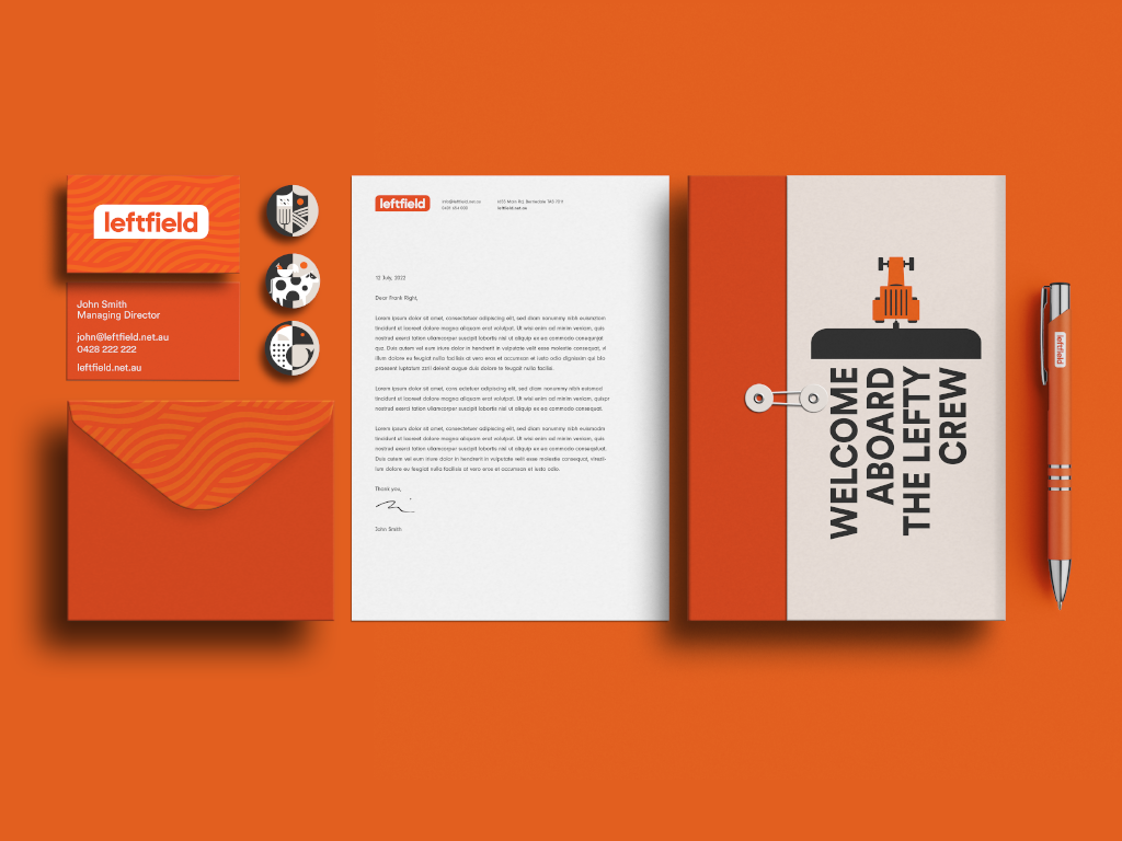
Left Field is an on-demand staffing service specializing in the placement of agricultural workers with farmers in Tasmania, Australia. Their target audience – are the locals and international backpackers looking for an adventure with some seasonal work to help pay for it. They came to us after acquiring the business, with expanded service ideas, a brand new name, and the need for a complete brand overhaul.
In partnership with the client, we have designed the brand positioning and a visual identity system consisting of a logo, and a reduced color palette inspired by the early sunrises and late sunsets on a Tasmanian farm. A custom set of patterns influenced by the patterns found in the crops grown on various farms, and a set of bold geometric illustrations. The final deliverables consisted of a brand guidelines document to govern the newly designed brand identity system, a website, and various marketing materials. The website work not only consisted of visual design but also content strategy and copy. While we kept the website simple and easy to use, we found a few opportunities for delight through animations – for example, right after a job seeker submits a job application they are greeted by a farmer and his dog driving out into the fields to get started with the day.
05.31.15 — Krasula Pierogi Bar
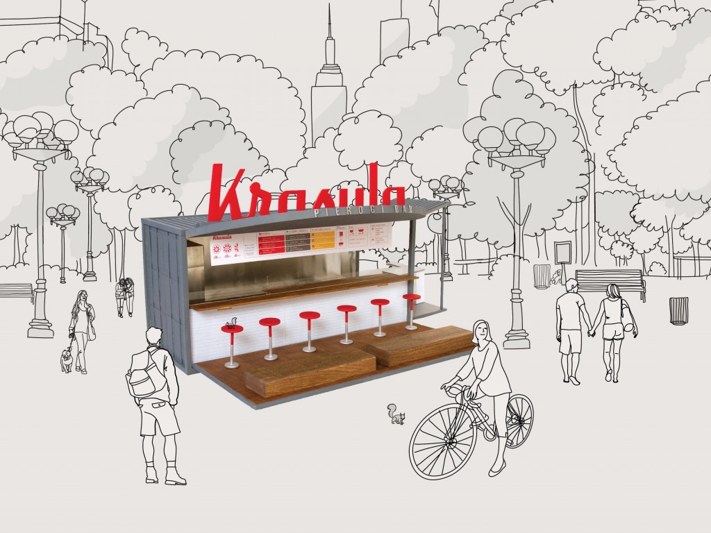
Krasula is a pop-up pierogi bar that brings modern Polish flavor to the bustling New York food scene. Eastern European soul food – the pierogi is a half-moon shaped dumpling, traditionally made by hand, filled with sweet or savory ingredients. At Krasula menu offerings are simple, made with fresh, natural ingredients, and an array of rejuvenated pierogi fillings, toppings, and whole grains. However you will always find, the traditional pierogi such as potato & cheese and cabbage on the menu. We cater to the traditional eater, as well as the vegetarian, the vegan and the gluten free conscious persons.
This is is a self-initiated project, conceived out of Joanna’s love for Pierogi and the need of elevating Polish culinary culture in New York. We have fully branded the bar, re-designed the recipes and sauces, stylized food plates and designed the physical experience of the space. We are currently looking for like minded, pierogi loving investors, if you are one please don’t hesitate to reach out. To learn more please visit the website: krasulapierogibar.com
Krasula is the winner of Martha Stewart American Made Elevator Pitch competition.
07.27.23 — Fairtrade – Small Roaster Program
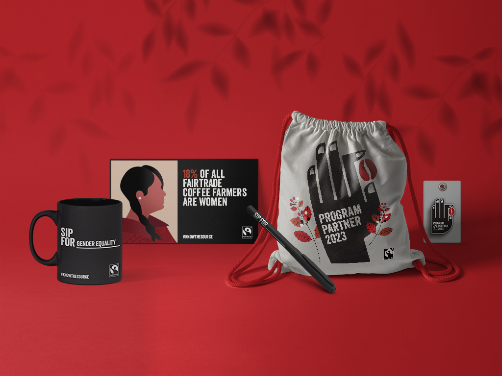
Supporting coffee farmers is crucial. Especially smallholder farmers who produce 80% of the world’s coffee but often struggle to earn a decent living. Fairtrade Canada has taken action by introducing the Know the Source small-roaster program, for cafés and restaurants that offer Fairtrade-certified coffee. Canadians have the power to make a difference by choosing Fairtrade coffee, directly contributing to the well-being of over 750,000 coffee farmers. This support helps them thrive in an uncertain market, ensuring they receive fair incomes, protect their local environment, and invest in their farms and communities.
The team at Fairtrade Canada entrusted us with the exciting task of designing and developing a logo mark and digital toolkit for this program to be used by the participating establishments. The logo, featuring a hand holding a single coffee bean, represents the dedication of Fairtrade coffee farmers. Alongside captivating illustrations and enlightening educational facts, these visuals shed light on the challenges faced by coffee farmers in today’s world. We hope that every sip of Fairtrade coffee deepens coffee enthusiasts’ understanding and appreciation for the positive impact each coffee bean can make when farmers thrive in their livelihoods. So, what inspires your sips? Join the movement, choose Fairtrade coffee, and be a force for good! Together, we can create a sustainable and equitable future for all. #knowthesource
08.13.23 — Fairtrade International
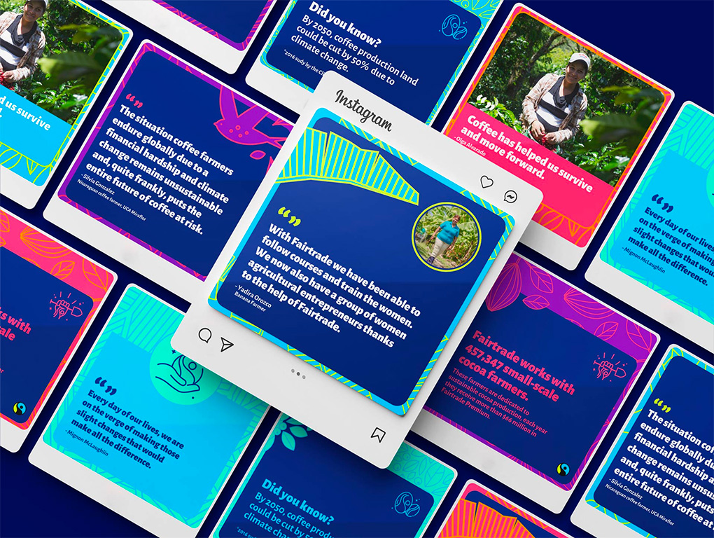
In partnership with Fairtrade International, Fairtrade America, and Fairtrade Canada, we meticulously designed a broad rage of social media post design templates in flexible formats. Taking cues from Fairtrade’s vibrant photography of global producer partners and commodities, we developed unique background patterns and visual elements. Every template—from our animated intro and outro reels to IG stories, IG reels and carousel posts—incorporates these designs, ensuring consistency and alignment with Fairtrade’s brand guidelines. Our user-friendly template system equips Fairtrade’s in-house teams around the world with versatile building blocks they can extend as required. These designs not only help enhance their social media narratives they also amplify the importance of choosing Fairtrade products.
08.26.23 — Upwork
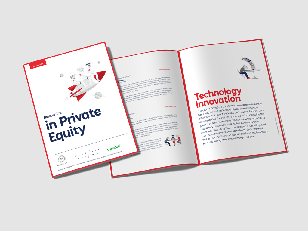
UpWork chose us to design an exclusive report on “Innovations in Private Equity,” based on their own research findings. We took a hands-on approach, crafting the report with simple layouts, engaging infographics, and a series of custom illustrations tailored for this project. These design elements didn’t just fit seamlessly with the content; they also added a humorous twist. We executed the entire project under the Milk Bar Design brand, showcasing our unique visual language. In addition to the report, have have also been tasked by UpWork to design a set of conversation cups for a networking event – this time using UpWork’s color theme – we made our cow be the hero.
Joanna, the founder of Milk Bar Design, took inspiration from the community spirit of Poland’s “Milk Bars” to shape her studio’s unique ethos. This ethos comes to life through three symbolic milk-producing animals—Goat, Cow, and Sheep. Each animal represents a core principle that guides our work: the Goat symbolizes visionary thinking, the Cow embodies strong work ethic, and the Sheep stands for our commitment to transformative design. These principles influence all our design engagements, including this report for UpWork.
01.26.16 — Americord
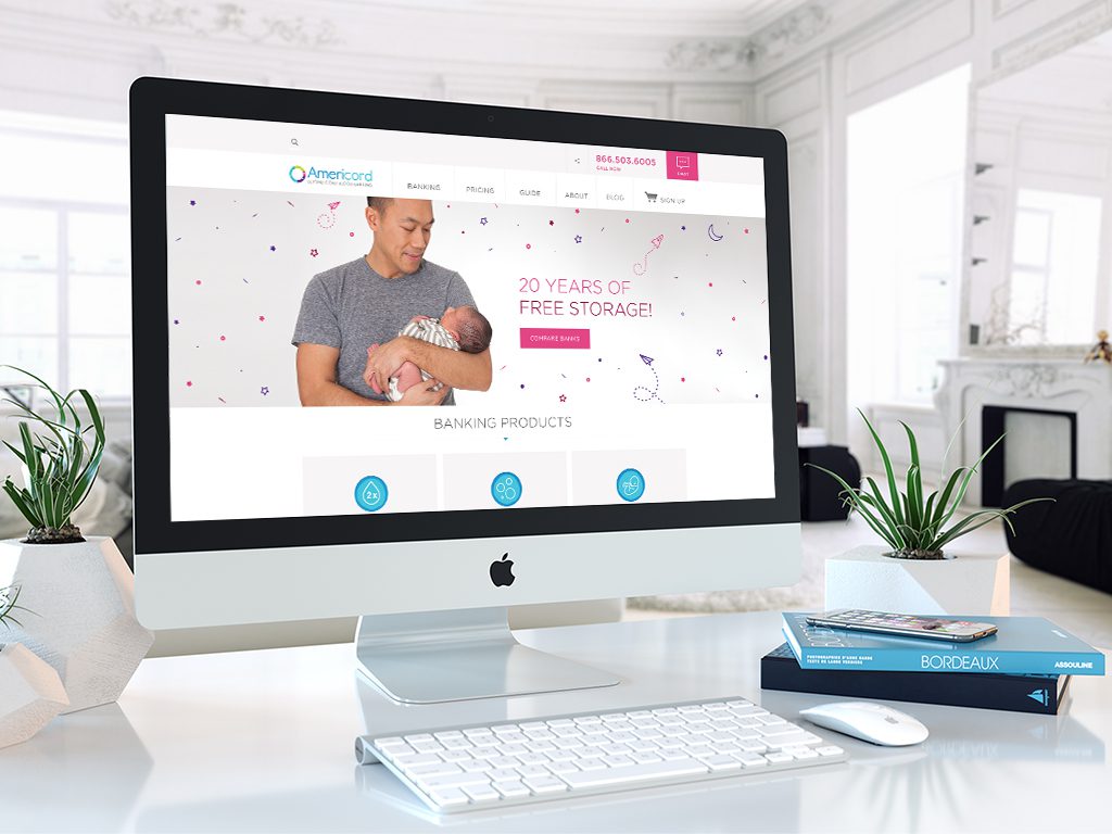
Americord is a leader in the advancement of umbilical cord blood, cord tissue, and placenta tissue banking. They are a private bank, which collects, processes, and stores stem cells for future medical or therapeutic use by the family who saves them. Americord reached out to us when they were looking for a digital partner to help refresh their brand, redesign their website and broaden various marketing materials.
With the website task, we had set out to first reorganize and simply the complex and often overwhelming information of stem cell banking. We created a brand new site map and reduced the number of unnecessary pages, followed by a complete set of wireframes which we later translated into simplified responsive visual layouts. Together with Americord’s team we took the already existing complex copy content and completely redefined it. We created illustrations, infographics and a set of product icons which allowed us to make informative points more clearly and allow layouts to have elements of visual fun. In addition we restructured and simplified the check out process, making it fast and easy for customers to enroll. Lastly we helped organize and art direct a photoshoot of children, moms-to-be and parents.
We have had the privilege of continuously working with Americord since April of 2014 and in addition to the website work, we have been delivering ads, landing pages, emails and print marketing materials on regular basis.

