Posts tagged ‘Illustration’
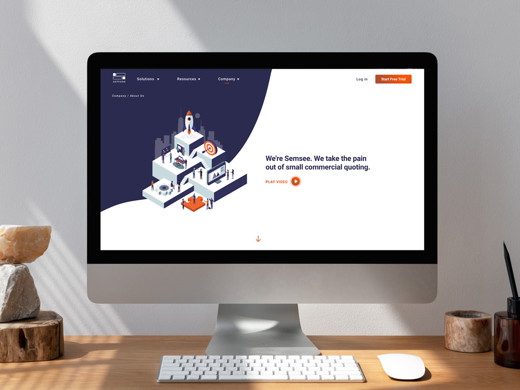
07.22.22 — Semsee
We have worked with Semsee on an ongoing basis for almost 4 years – where does the time go? Initially, we had been tasked with an audit of their app and brand elements. After taking a closer look we decided to engage in a bigger app redesign and larger expansion of their brad elements by leveraging illustration. We set to work by first redesigning their digital product – a platform where insurance agents come to quote small commercial business insurance for their clients. Together with team Semsee, we designed an easy-to-use web app, where agents fill out a single form and get multiple quotes from various carriers – allowing them to quickly compare results and manage their clients and business all in one place.
We have also designed Semsee’s website as well as many marketing materials such as digital brochures, white papers, surveys, social templates, holiday cards, and more. Semsee has been a great partner to work with and we are delighted they now have their own in-house design team.
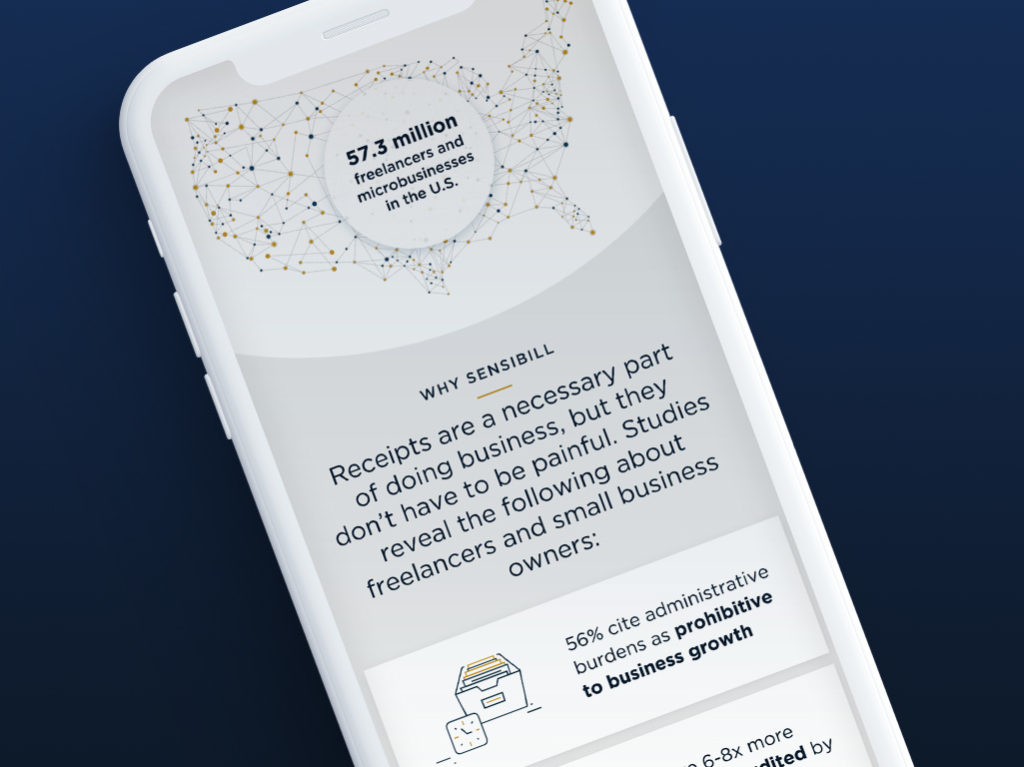
12.13.18 — Sensibill
We had the privilege of designing the new Sensibill website. Sensibill is a receipt management solution for mobile banking apps. The work included site-mapping, wireframes, ux and visual design in order to deliver fully responsive experience. Working together with Sensibill’s marketing team we were able to strategize and define a clear product offering, through the usage of simple messaging and visual touch points such as illustrations, icons, product mockups and patterns.
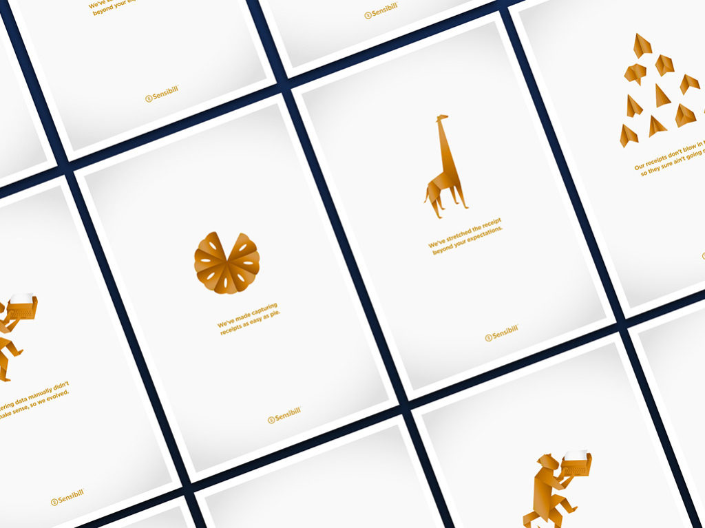
12.14.18 — Sensibill
We have been working with Sensibill for over 5 years, these are some examples of promotional touch-points we helped develop for the marketing team. They include infographics, post cards, flyers, posters and give away items such as a deck of cards.
04.27.20 — Kooltra
Kooltra is the only cloud-based, post-trade management system designed for FX brokers, integrated with currency trade execution platforms for a seamless and fast use. Their powerful analytics, customizable dashboard and risk management tools allow FX brokers to stay on top of their business of currency trading in real time. Kooltra serves agency, margin, institutional and deliverable brokers, corporate MSBs in North American and Europe.
We set out to design a logo mark which would directly represent the function of Kooltra. This being a two fold notion – the idea of a bridge automatically bringing together information normally reserved to manual Excel spreadsheets and the idea of clarity – taking complex and vast amount of information and distilling it into one simple system. Our work included logo design and brand development, website design and marketing materials such as PowerPoint presentations, one pagers and a set of posters. We developed a reduced color palette, unique illustrations, iconography, patterns – then applied this visual language consistently though-out all of the touch points. Together with Kooltra’s marketing team we were able to research, strategize, and define their brand values and develop a consistant brand voice. They have been a great partner to work with and it is our hope this new design system serves them well into the future.
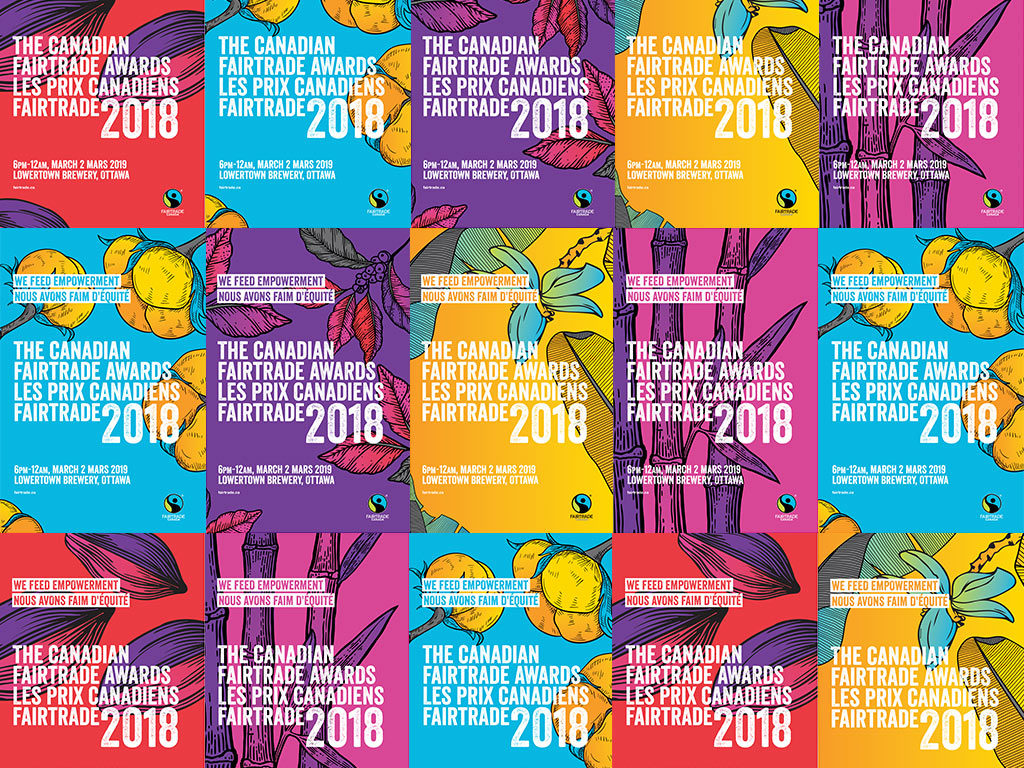
09.27.19 — Fairtrade Canada
The Canadian Fairtrade Awards recognize exceptional Fairtrade supporters, partners and allies, including retailers, traders, towns and campuses. The event is a celebration and a chance to say thank you to members of the Fairtrade community who made their mission to advocate for a sustainable, fair global trade system free of injustices. The event was also an opportunity to come together and truly feel the power of the collective work across Canada.
We have been a fan of Fairtrade products and the mission behind them for as long as we can remember. So naturally when Fairtrade Canada marketing team asked us to design the awards program we were thrilled! We were tasked in developing a series of posters, social media posts, event schedule, postcards, on screen graphics displayed during the event as well as winner announcement screens. We decided to place products and the farmers of those products at the center of our visual approach. We used the vibrant color palette of Fairtrade branding and paired it with product illustrations to invoke celebratory mood. Was also saw it as an opportunity to show the beauty of coffee leaves, cotton, sugar cane, banana leaves and flowers as well as coco.
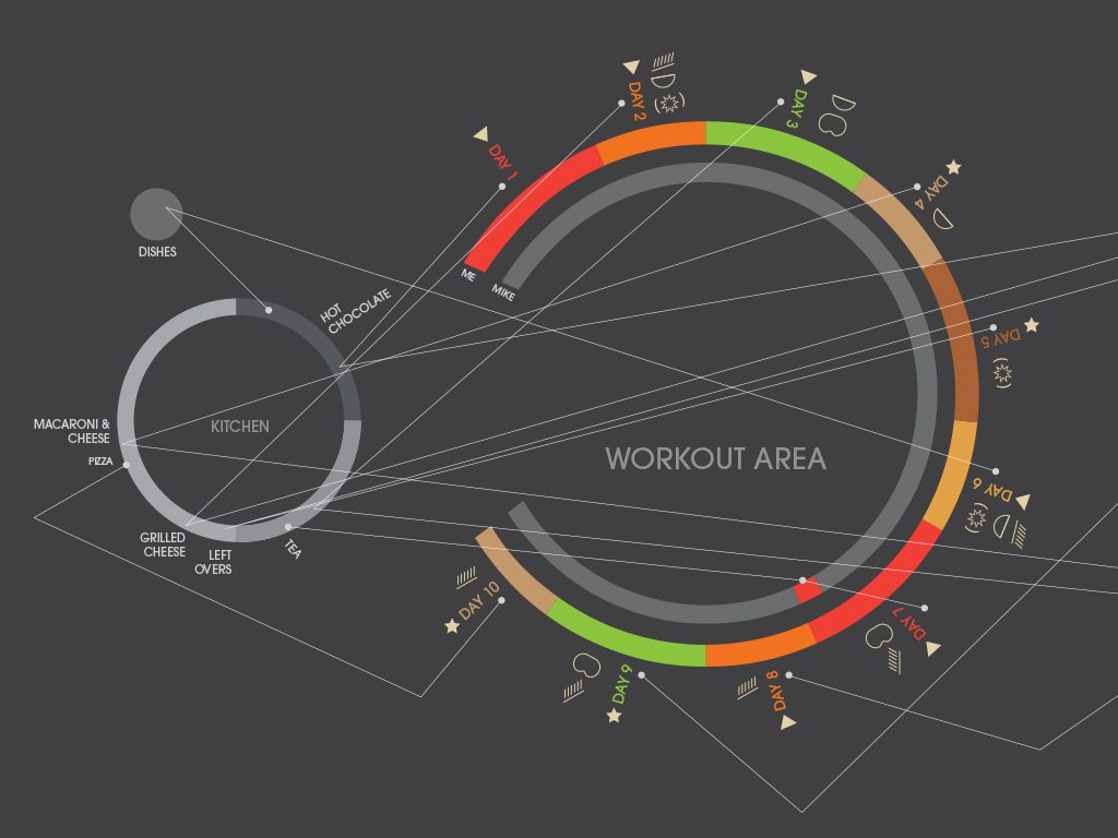
01.26.16 — P90X
This infographic demonstrates the process using the data carefully collected and the results of a 10-day P90X trial. However the primary goal of this experiment was to see whether or not Mike who hasn’t worked out in 14 years was actually going to commit to it.
Most of the data shows what he was doing instead of working out with his partner. He didn’t know he was being tracked and the results speak for themselves. The partner who did commit to the workouts, was very sore in areas she didn’t know existed but began to see transformation rather quickly.
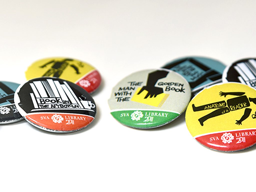
05.11.16 — School of Visual Arts Library Campaign
We were commissioned by the School of Visual Arts Library, to create a promotional campaign for the start of the new school year at the library. We felt it was appropriate to reference the timeless designs by Saul Bass, who was an iconic Graphic Designer across a range of media. Final deliverables were a series of buttons and a bookmark distributed to all students to use and enjoy.