Posts tagged ‘Poster design’
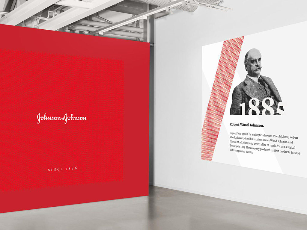
01.04.18 — Johnson & Johnson
In preparation of Johnson & Johnson’s 130 year anniversary, and the opening of their state of the art museum, we were tasked with this exciting Heritage Identity project. The idea was to create an appropriately differentiated sub-brand for J&J, to bring awareness to the past and inspire audiences to be pivotal in shaping J&J’s future. Together with J&J Design team we have built a sub-brand with inspirational, long-lasting and innovative personality. Through visual language we expressed some of the accomplishments this astonishing company has delivered since its humble beginnings of 1886.
We have created a tool kit with an array of assets, such as logo treatments, patterns, a presentation template and merchandise concepts. In addition we have designed a series of posters, invitations and banners. Deliverables also included wall and window graphic treatments for special events.
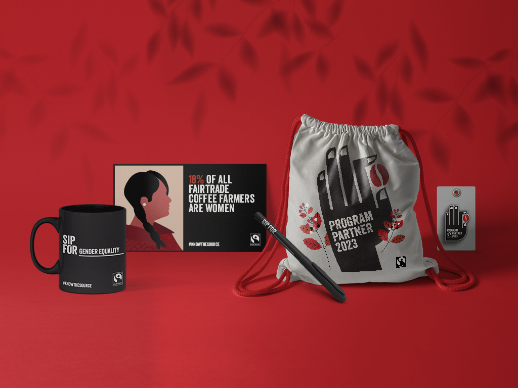
07.27.23 — Fairtrade – Small Roaster Program
Supporting coffee farmers is crucial. Especially smallholder farmers who produce 80% of the world’s coffee but often struggle to earn a decent living. Fairtrade Canada has taken action by introducing the Know the Source small-roaster program, for cafés and restaurants that offer Fairtrade-certified coffee. Canadians have the power to make a difference by choosing Fairtrade coffee, directly contributing to the well-being of over 750,000 coffee farmers. This support helps them thrive in an uncertain market, ensuring they receive fair incomes, protect their local environment, and invest in their farms and communities.
The team at Fairtrade Canada entrusted us with the exciting task of designing and developing a logo mark and digital toolkit for this program to be used by the participating establishments. The logo, featuring a hand holding a single coffee bean, represents the dedication of Fairtrade coffee farmers. Alongside captivating illustrations and enlightening educational facts, these visuals shed light on the challenges faced by coffee farmers in today’s world. We hope that every sip of Fairtrade coffee deepens coffee enthusiasts’ understanding and appreciation for the positive impact each coffee bean can make when farmers thrive in their livelihoods. So, what inspires your sips? Join the movement, choose Fairtrade coffee, and be a force for good! Together, we can create a sustainable and equitable future for all. #knowthesource
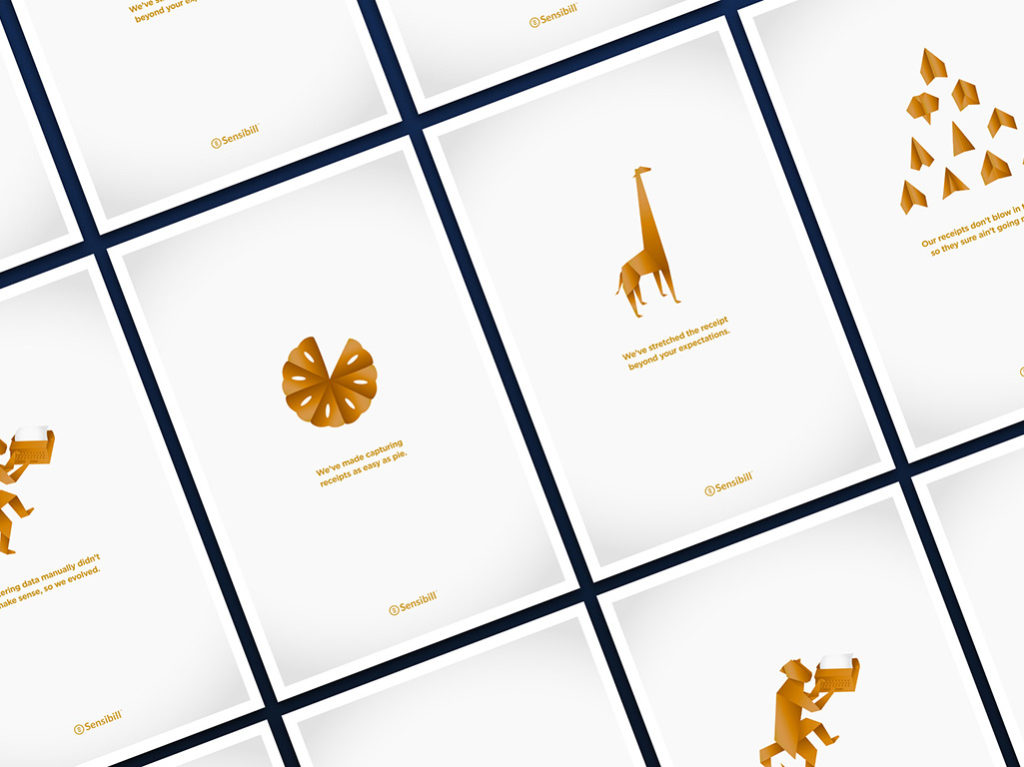
12.14.18 — Sensibill
We have been working with Sensibill for over 5 years, these are some examples of promotional touch-points we helped develop for the marketing team. They include infographics, post cards, flyers, posters and give away items such as a deck of cards.
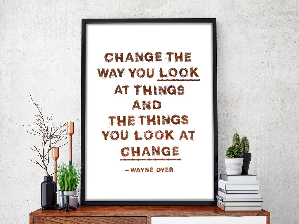
05.16.16 — The way to look at things
This particular thought is a brilliant life lesson and has become my go-to principle in work and in life. In reality this notion requires daily practice and at times is challenging to achieve therefore we thought it would be fitting to express it using the tiny kiwi seeds. This project took about two weeks, mainly because the kiwi seeds needed time to dry and had to be completely separated from the green “meat” of the kiwi. Nothing went to waste, with the left over fruit we made kiwi smoothies.
These two alphabet posters with sweet little lessons for children, hand-made out of color pencil shavings; I designed for my dear friend Camille’s beautiful twin baby girls.