Posts tagged ‘Social media’
08.02.23 — Respect
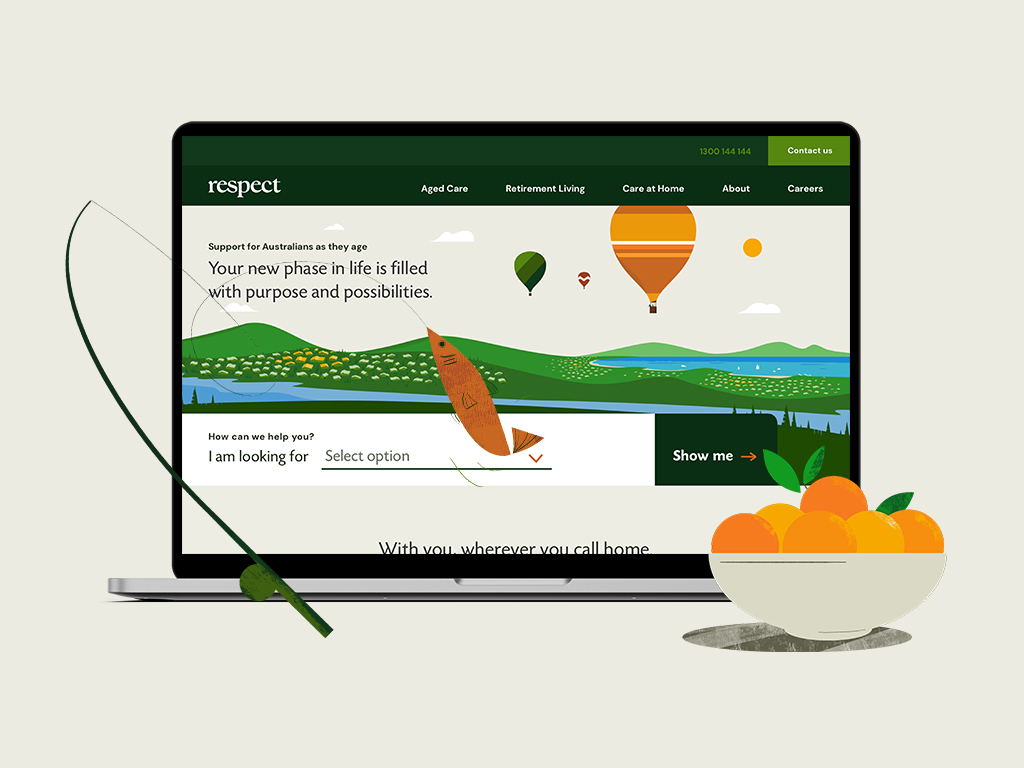
Respect is an established Australian non-profit organization, operating since 1922, supporting individuals and families as they navigate the journey of aging through in-home care, retirement living, and aged care services.
We partnered with Respect to lead a complete brand transformation—redefining their positioning, value proposition, and messaging architecture to better reflect the depth and breadth of their offerings. A key challenge was unifying distinct audiences, from independent senior living to aged care, while maintaining clarity and empathy across all touchpoints.
Inspired by the natural rhythm of life’s seasons, we developed a comprehensive brand system including a new visual identity, vibrant color palette, and a suite of custom illustrations and animations designed to bring warmth and humanity to the experience. We extended this system across a multi-site digital ecosystem, designing the main Respect website along with dedicated retirement living sites, supported by integrated marketing materials and out-of-home campaigns.
At the core of the work was a thoughtful content strategy—addressing sensitive decision-making moments and helping reduce the stigma often associated with aged care, while guiding families with clarity and compassion. The result is a cohesive, future-forward brand that unifies Respect’s offerings and strengthens their connection with the communities they serve.
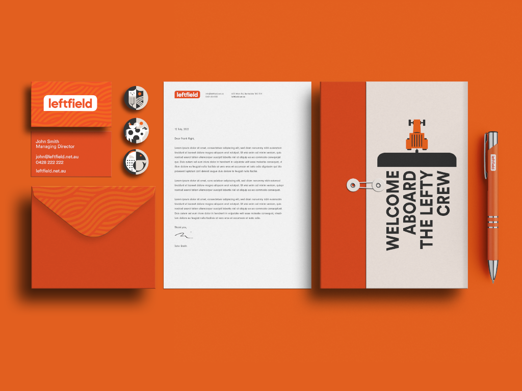
07.07.22 — Left Field
Left Field is an on-demand staffing service specializing in the placement of agricultural workers with farmers in Tasmania, Australia. Their target audience – are the locals and international backpackers looking for an adventure with some seasonal work to help pay for it. They came to us after acquiring the business, with expanded service ideas, a brand new name, and the need for a complete brand overhaul.
In partnership with the client, we have designed the brand positioning and a visual identity system consisting of a logo, and a reduced color palette inspired by the early sunrises and late sunsets on a Tasmanian farm. A custom set of patterns influenced by the patterns found in the crops grown on various farms, and a set of bold geometric illustrations. The final deliverables consisted of a brand guidelines document to govern the newly designed brand identity system, a website, and various marketing materials. The website work not only consisted of visual design but also content strategy and copy. While we kept the website simple and easy to use, we found a few opportunities for delight through animations – for example, right after a job seeker submits a job application they are greeted by a farmer and his dog driving out into the fields to get started with the day.
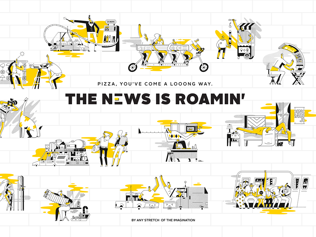
01.25.16 — Stretch Roman Pizza Co.
We were approached by a group of successful restaurateurs to design the brand for their new idea – a Roman style pizza restaurant, inspired by the popular gourmet street food of Rome, a fluffy delicious, rectangular pie called “pizza al taglio”.
We set out to design a brand whose primary goal was to offer an honest, moment of delight with delicious pizza supported by imaginative brand voice. Stretch pizza inspires culinary creativity, so we placed an element of play at the core of all brand’s communications. It is expressed in the food served, logo design, illustrations, photography, language, merchandize and in the interior design of the space as well as the website. We have created a fun and flexible system on which we can only continue to build on.
We especially enjoyed collaborating and art directing a set of quirky illustrations that celebrate the personality of Stretch and serve as tone of this brand. They appear on packaging, website, and throughout the restaurant. We asked ourselves, if Stretch is imaginative, why not imagine the world of Stretch? Stretch illustrations express this world through humor of the unexpected yet relatable situations of daily life as they relate to physical or metaphorical acts of stretching. After all who doesn’t love a good Stretch.
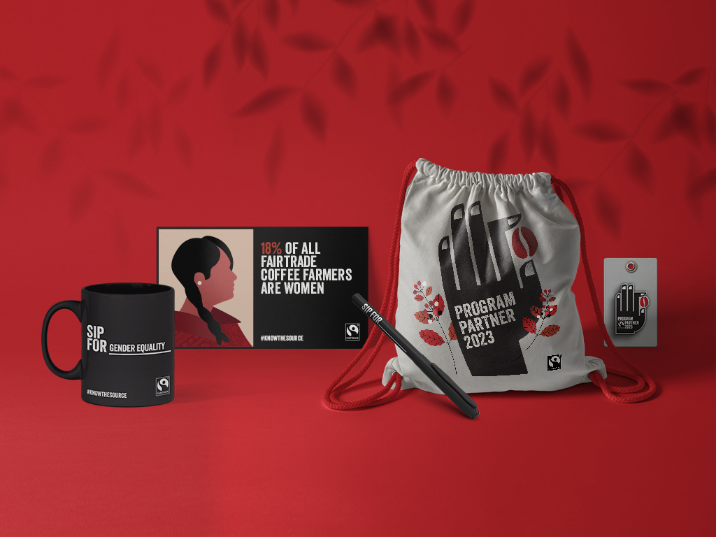
07.27.23 — Fairtrade – Small Roaster Program
Supporting coffee farmers is crucial. Especially smallholder farmers who produce 80% of the world’s coffee but often struggle to earn a decent living. Fairtrade Canada has taken action by introducing the Know the Source small-roaster program, for cafés and restaurants that offer Fairtrade-certified coffee. Canadians have the power to make a difference by choosing Fairtrade coffee, directly contributing to the well-being of over 750,000 coffee farmers. This support helps them thrive in an uncertain market, ensuring they receive fair incomes, protect their local environment, and invest in their farms and communities.
The team at Fairtrade Canada entrusted us with the exciting task of designing and developing a logo mark and digital toolkit for this program to be used by the participating establishments. The logo, featuring a hand holding a single coffee bean, represents the dedication of Fairtrade coffee farmers. Alongside captivating illustrations and enlightening educational facts, these visuals shed light on the challenges faced by coffee farmers in today’s world. We hope that every sip of Fairtrade coffee deepens coffee enthusiasts’ understanding and appreciation for the positive impact each coffee bean can make when farmers thrive in their livelihoods. So, what inspires your sips? Join the movement, choose Fairtrade coffee, and be a force for good! Together, we can create a sustainable and equitable future for all. #knowthesource