Posts tagged ‘Typography’
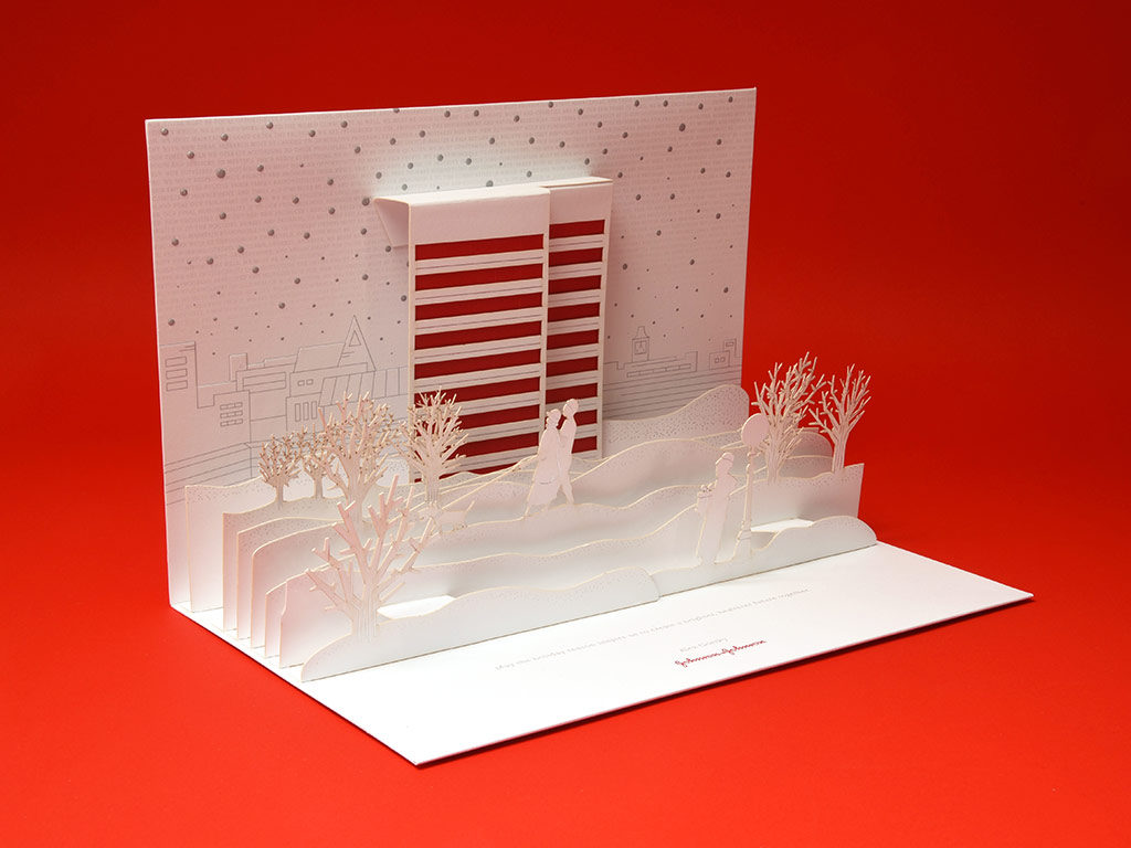
01.15.17 — Johnson & Johnson
We had the privilege of working with J&J Design to concept and develop pop-up Holiday Cards for Johnson & Johnson’s CEO Alex Gorsky. Initially we explored 4 distinct directions. When the 3D pop-up idea was selected, we developed 3 different pop-up winter scene concepts as well as card mechanicals. Once the final concept was approved, we worked on developing final color palette as well as print techniques such as foil, embossing and laser cutting.
Working closely with J&J Design and Structural Graphics we were able to enjoy the design process, produce a unique card design and deliver it just in time for the holidays. This was truly a fun project as print design with such attention to detail is something we truly treasure.
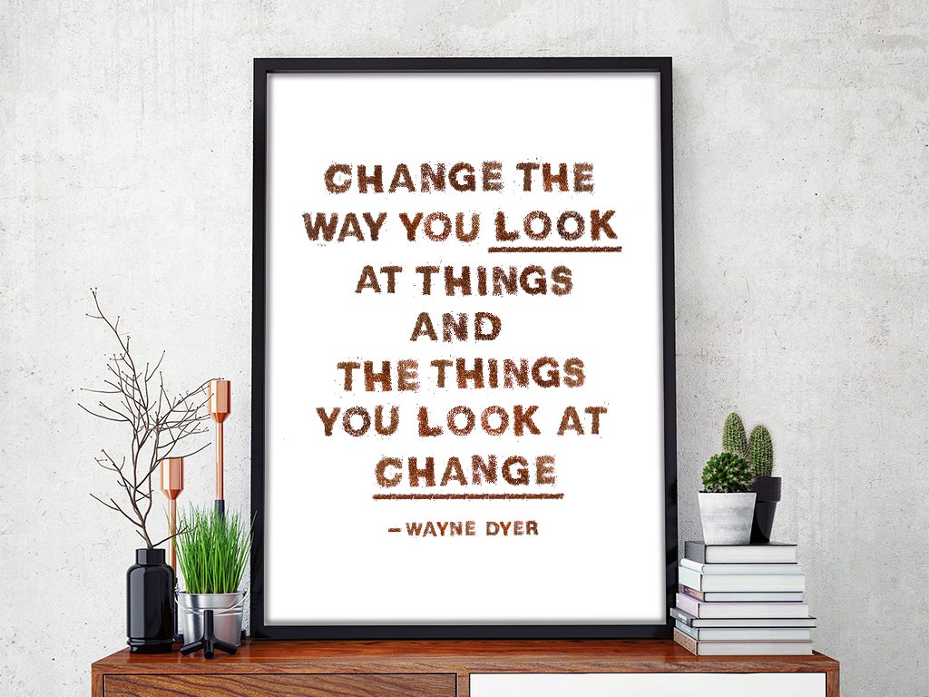
05.16.16 — The way to look at things
This particular thought is a brilliant life lesson and has become my go-to principle in work and in life. In reality this notion requires daily practice and at times is challenging to achieve therefore we thought it would be fitting to express it using the tiny kiwi seeds. This project took about two weeks, mainly because the kiwi seeds needed time to dry and had to be completely separated from the green “meat” of the kiwi. Nothing went to waste, with the left over fruit we made kiwi smoothies.
These two alphabet posters with sweet little lessons for children, hand-made out of color pencil shavings; I designed for my dear friend Camille’s beautiful twin baby girls.