Posts tagged ‘Website design’
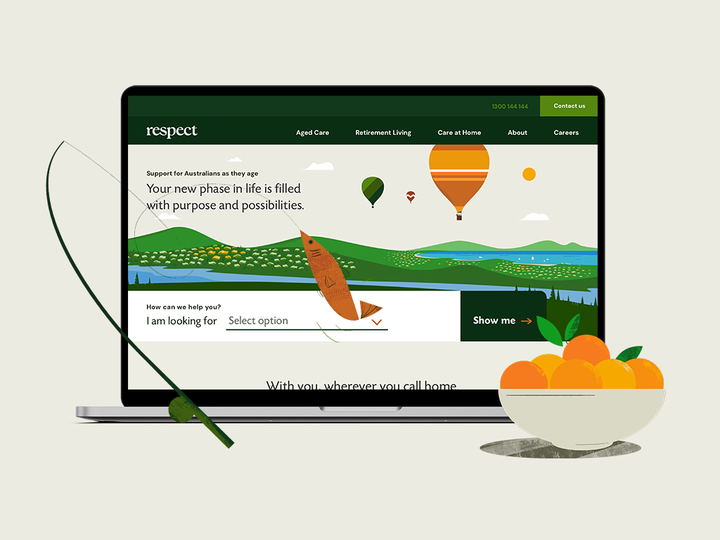
08.02.23 — Respect
Respect is an established Australian non-profit organization, operating since 1922, supporting individuals and families as they navigate the journey of aging through in-home care, retirement living, and aged care services.
We partnered with Respect to lead a complete brand transformation—redefining their positioning, value proposition, and messaging architecture to better reflect the depth and breadth of their offerings. A key challenge was unifying distinct audiences, from independent senior living to aged care, while maintaining clarity and empathy across all touchpoints.
Inspired by the natural rhythm of life’s seasons, we developed a comprehensive brand system including a new visual identity, vibrant color palette, and a suite of custom illustrations and animations designed to bring warmth and humanity to the experience. We extended this system across a multi-site digital ecosystem, designing the main Respect website along with dedicated retirement living sites, supported by integrated marketing materials and out-of-home campaigns.
At the core of the work was a thoughtful content strategy—addressing sensitive decision-making moments and helping reduce the stigma often associated with aged care, while guiding families with clarity and compassion. The result is a cohesive, future-forward brand that unifies Respect’s offerings and strengthens their connection with the communities they serve.
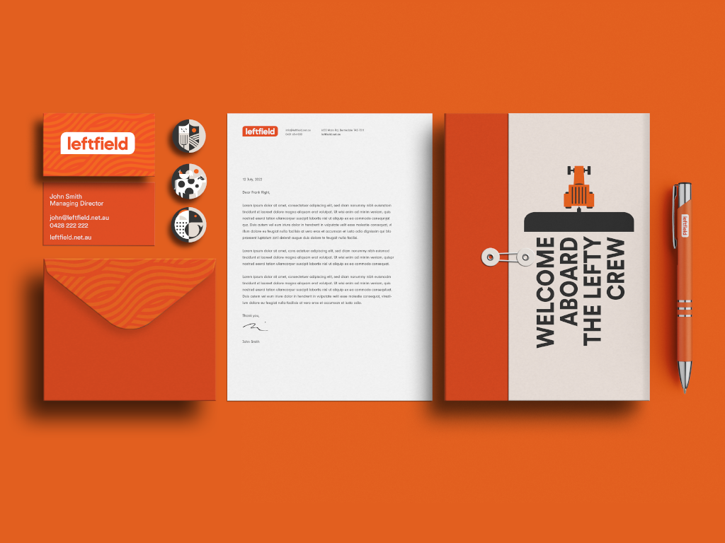
07.07.22 — Left Field
Left Field is an on-demand staffing service specializing in the placement of agricultural workers with farmers in Tasmania, Australia. Their target audience – are the locals and international backpackers looking for an adventure with some seasonal work to help pay for it. They came to us after acquiring the business, with expanded service ideas, a brand new name, and the need for a complete brand overhaul.
In partnership with the client, we have designed the brand positioning and a visual identity system consisting of a logo, and a reduced color palette inspired by the early sunrises and late sunsets on a Tasmanian farm. A custom set of patterns influenced by the patterns found in the crops grown on various farms, and a set of bold geometric illustrations. The final deliverables consisted of a brand guidelines document to govern the newly designed brand identity system, a website, and various marketing materials. The website work not only consisted of visual design but also content strategy and copy. While we kept the website simple and easy to use, we found a few opportunities for delight through animations – for example, right after a job seeker submits a job application they are greeted by a farmer and his dog driving out into the fields to get started with the day.
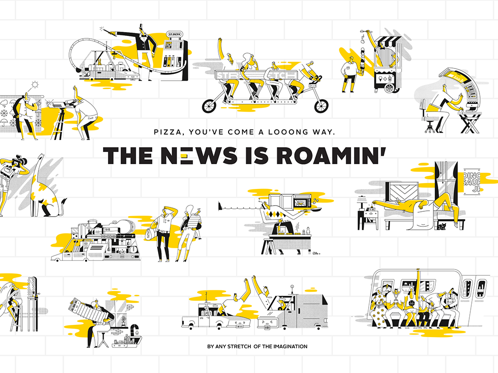
01.25.16 — Stretch Roman Pizza Co.
We were approached by a group of successful restaurateurs to design the brand for their new idea – a Roman style pizza restaurant, inspired by the popular gourmet street food of Rome, a fluffy delicious, rectangular pie called “pizza al taglio”.
We set out to design a brand whose primary goal was to offer an honest, moment of delight with delicious pizza supported by imaginative brand voice. Stretch pizza inspires culinary creativity, so we placed an element of play at the core of all brand’s communications. It is expressed in the food served, logo design, illustrations, photography, language, merchandize and in the interior design of the space as well as the website. We have created a fun and flexible system on which we can only continue to build on.
We especially enjoyed collaborating and art directing a set of quirky illustrations that celebrate the personality of Stretch and serve as tone of this brand. They appear on packaging, website, and throughout the restaurant. We asked ourselves, if Stretch is imaginative, why not imagine the world of Stretch? Stretch illustrations express this world through humor of the unexpected yet relatable situations of daily life as they relate to physical or metaphorical acts of stretching. After all who doesn’t love a good Stretch.
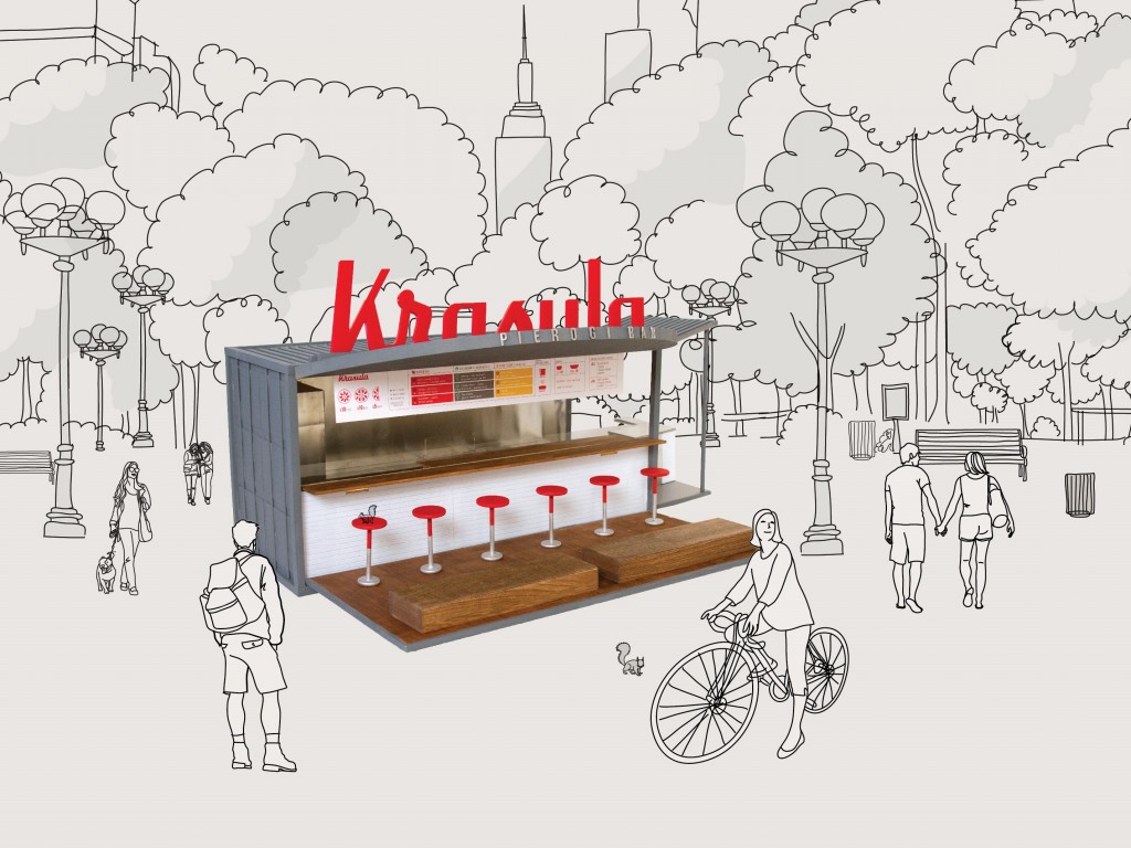
05.31.15 — Krasula Pierogi Bar
Krasula is a pop-up pierogi bar that brings modern Polish flavor to the bustling New York food scene. Eastern European soul food – the pierogi is a half-moon shaped dumpling, traditionally made by hand, filled with sweet or savory ingredients. At Krasula menu offerings are simple, made with fresh, natural ingredients, and an array of rejuvenated pierogi fillings, toppings, and whole grains. However you will always find, the traditional pierogi such as potato & cheese and cabbage on the menu. We cater to the traditional eater, as well as the vegetarian, the vegan and the gluten free conscious persons.
This is is a self-initiated project, conceived out of Joanna’s love for Pierogi and the need of elevating Polish culinary culture in New York. We have fully branded the bar, re-designed the recipes and sauces, stylized food plates and designed the physical experience of the space. We are currently looking for like minded, pierogi loving investors, if you are one please don’t hesitate to reach out. To learn more please visit the website: krasulapierogibar.com
Krasula is the winner of Martha Stewart American Made Elevator Pitch competition.
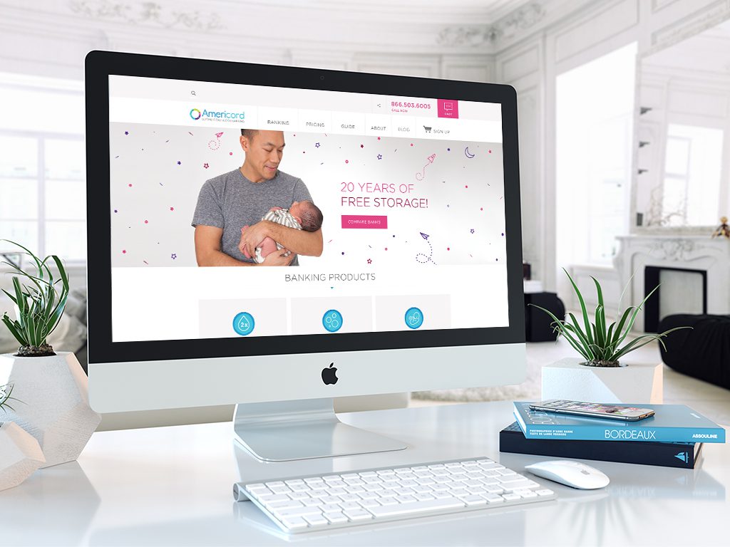
01.26.16 — Americord
Americord is a leader in the advancement of umbilical cord blood, cord tissue, and placenta tissue banking. They are a private bank, which collects, processes, and stores stem cells for future medical or therapeutic use by the family who saves them. Americord reached out to us when they were looking for a digital partner to help refresh their brand, redesign their website and broaden various marketing materials.
With the website task, we had set out to first reorganize and simply the complex and often overwhelming information of stem cell banking. We created a brand new site map and reduced the number of unnecessary pages, followed by a complete set of wireframes which we later translated into simplified responsive visual layouts. Together with Americord’s team we took the already existing complex copy content and completely redefined it. We created illustrations, infographics and a set of product icons which allowed us to make informative points more clearly and allow layouts to have elements of visual fun. In addition we restructured and simplified the check out process, making it fast and easy for customers to enroll. Lastly we helped organize and art direct a photoshoot of children, moms-to-be and parents.
We have had the privilege of continuously working with Americord since April of 2014 and in addition to the website work, we have been delivering ads, landing pages, emails and print marketing materials on regular basis.
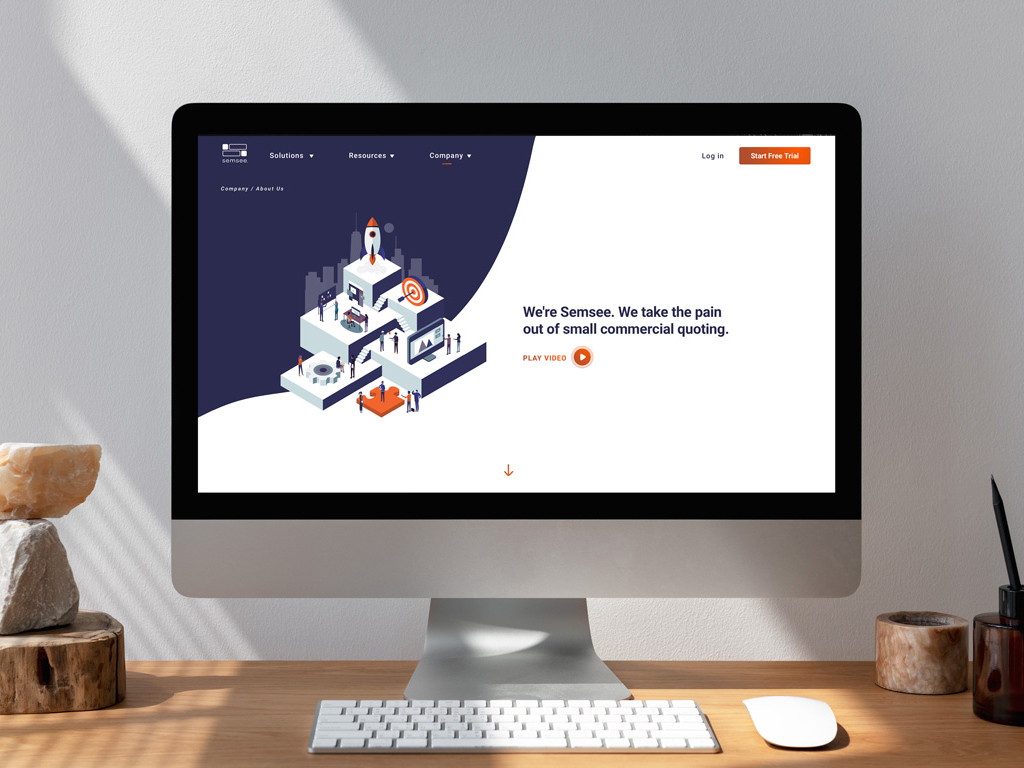
07.22.22 — Semsee
We have worked with Semsee on an ongoing basis for almost 4 years – where does the time go? Initially, we had been tasked with an audit of their app and brand elements. After taking a closer look we decided to engage in a bigger app redesign and larger expansion of their brad elements by leveraging illustration. We set to work by first redesigning their digital product – a platform where insurance agents come to quote small commercial business insurance for their clients. Together with team Semsee, we designed an easy-to-use web app, where agents fill out a single form and get multiple quotes from various carriers – allowing them to quickly compare results and manage their clients and business all in one place.
We have also designed Semsee’s website as well as many marketing materials such as digital brochures, white papers, surveys, social templates, holiday cards, and more. Semsee has been a great partner to work with and we are delighted they now have their own in-house design team.
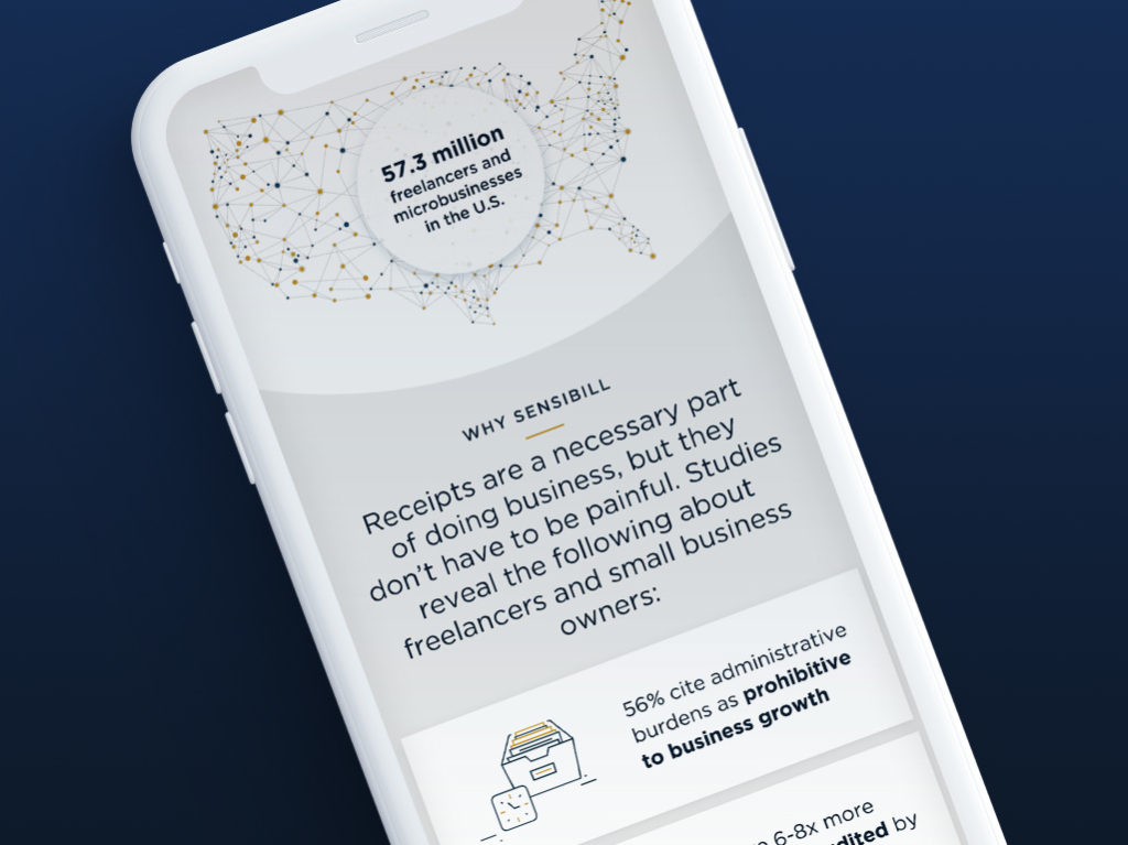
12.13.18 — Sensibill
We had the privilege of designing the new Sensibill website. Sensibill is a receipt management solution for mobile banking apps. The work included site-mapping, wireframes, ux and visual design in order to deliver fully responsive experience. Working together with Sensibill’s marketing team we were able to strategize and define a clear product offering, through the usage of simple messaging and visual touch points such as illustrations, icons, product mockups and patterns.
04.27.20 — Kooltra
Kooltra is the only cloud-based, post-trade management system designed for FX brokers, integrated with currency trade execution platforms for a seamless and fast use. Their powerful analytics, customizable dashboard and risk management tools allow FX brokers to stay on top of their business of currency trading in real time. Kooltra serves agency, margin, institutional and deliverable brokers, corporate MSBs in North American and Europe.
We set out to design a logo mark which would directly represent the function of Kooltra. This being a two fold notion – the idea of a bridge automatically bringing together information normally reserved to manual Excel spreadsheets and the idea of clarity – taking complex and vast amount of information and distilling it into one simple system. Our work included logo design and brand development, website design and marketing materials such as PowerPoint presentations, one pagers and a set of posters. We developed a reduced color palette, unique illustrations, iconography, patterns – then applied this visual language consistently though-out all of the touch points. Together with Kooltra’s marketing team we were able to research, strategize, and define their brand values and develop a consistant brand voice. They have been a great partner to work with and it is our hope this new design system serves them well into the future.
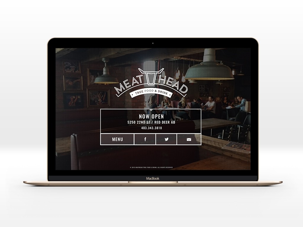
01.27.16 — Meathead True Food & Drink
Meathead is a new, polished, rustic dive-bar where everyone is welcome, offering a high-quality meat-focused menu at low prices. For this project we were asked to redesign their existing logo and create a series of menus, main front door signage, t-shirts, hats, business cards, a series of coasters and a landing page.
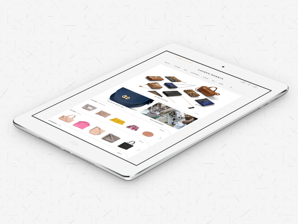
01.23.16 — Lauren Merkin
Lauren Merkin is a highly skilled designer of handbags thoughtfully crafted in New York City. While freelancing at Adler Design, Joanna was tasked to lead the redesign of the old Lauren Merkin website and make it easy for customers to shop and learn about the products. After research and strategy, we decided to refresh the look and feel of the brand, starting with the logo and corporate identity package. We created a set of cheerful illustrations, delicate patterns and used products as still life to create dynamic compositions in product photography. Followed by development of a new site map, a set of wireframes from which we built an easy to use user interface.